
The ANZAC weekend of footy is here again! We’ve found all the designs in the AFL and ranked them here from our least to most favourite.
Port Adelaide
I appreciate what Port was attempting to do here. Adding the names to the Guernsey is a nice touch, but with that being the only real addition to the design it doesn’t feel very significant of the day and will be lost when the intensity kicks up.
Essendon
I have always loved how clean this design is, it’s great. But Essendon have stuck with this design for nearly 11 years straight. A little bit of flare and change up wouldn’t go amiss.
Collingwood
Man I’m an awful Pies fan. Love the boys but this design feels very understated. I’ve never understood the pies always trying to hang out to the black and white bars. Similar to Essendon, a mix up here and there wouldn’t hurt. Its a great story behind this design but the design itself falls a little shy.
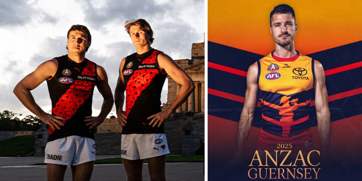
Richmond
I love the Wattle sash. It’s clean but with it mimicking Essendon’s too much it doesn’t stand out as its own. Plus similarly its a similar design they’ve done a few years in a row.
GWS Giants
Giants are bringing the army camo top back! A sleek design but it isn’t an original for the year but it still slaps.
Western Bulldogs
The names much like Port Adelaide get lost a little bit and I missed them entirely the first few times I saw it. The poppy’s rising from the red is a great touch.
Geelong
I love this design, a great way to encapsulate the moment to remember with the ANZAC cove but also making it still feel authentic Geelong.
Gold Coast Suns
I really dig what the Suns have down with their ANZAC clash. Embracing their fresh coat of paint the club has received this year and going all in on the poppy. I’m interested to see how it feels when the game kicks off and the action picks up but as a design it’s beautiful.
Melbourne
In an homage to the Australian military today the Demons have released a sleek modern look in juxtaposition to their gather round which felt more homage to their roots. The design is simple but carries the weight of the day in its messaged.
St Kilda
St Kilda please between gather round and this design my wallet can’t handle anymore fire designs. Give the design team a raise already.
Fremantle
Honestly I can’t express how gorgeous this is. Freo have kept it simple and have won me over for the weekend. The feather look, is amazing on their club purple.
Adelaide
I mean personally I think this is hands down thee most Australian ANZAC design. The colours feeling like sunset, the red giving me the feeling of poppy and of course the figure in the middle. Its perfect for the day.


